In interior design, visual tension is a dynamic force that captivates attention, stirs curiosity, and subtly influences how people experience a space. It’s a state of contrast or imbalance, where different design elements interact to create energy and vitality within a room. Far from being chaotic, the right level of tension introduces intrigue and balance, giving the space a sense of modernism and boldness. Here’s a closer look at the concept of visual tension, its benefits, and techniques to achieve it.
Understanding Visual Tension in Interior Design
Visual tension emerges from the deliberate use of contrast, creating a slight sense of imbalance or surprise. Think of a room with a perfectly symmetrical layout; it feels organized and balanced but can also lack excitement. By introducing tension—whether through asymmetry, contrasting textures, or juxtaposed styles—you inject energy and movement into the space. The outcome is a sense of anticipation, where the room feels “in motion” even when it’s static, engaging the viewer’s eye to explore every corner.
This state of tension can evoke various emotions, from energy and vitality to curiosity and elegance. It also impacts how people interact with the space: a room with visual tension invites exploration and keeps the experience dynamic and engaging. This design approach resonates with those who appreciate bold, impactful aesthetics, as well as spaces that blend heritage with modern elements.
Interior Design Cheshire
Techniques to Create Visual Tension in Interior Design
Asymmetrical Balance
Asymmetry brings a sense of surprise and dynamism, creating balance without perfect symmetry. It involves balancing visual weight, texture, and color on either side of a focal point, resulting in a relaxed yet engaging layout. For instance, placing a large, vibrant artwork on one side of a room and balancing it with a cluster of smaller, simpler items on the opposite side introduces visual interest. Asymmetrical balance is excellent for creating visual tension as it makes a space feel more “alive” and less predictable.
Varying Spatial Tension
Playing with spatial arrangement can create rhythm and flow, adding a sense of movement to a space. Placing some furniture or accessories closer together while leaving others spaced farther apart creates focal points that guide the eye around the room. This technique adds a unique kind of tension by building up and releasing visual “pressure,” keeping the space from feeling static.
Contrasting Colours and Textures
Bold colour combinations and varying textures introduce contrast, creating both tension and harmony. For instance, pairing soft, neutral walls with a striking, dark accent wall generates visual drama. Additionally, contrasting textures—like pairing a sleek marble countertop with rustic wooden cabinets—draw attention by highlighting each material's unique qualities.
Mixing Old and New Elements
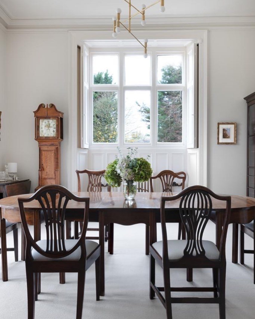
The fusion of vintage pieces with contemporary designs is a powerful way to create visual tension, adding character and richness to a room. The juxtaposition of old and new elements balances tradition with modern aesthetics. For example, placing an antique mirror above a minimalist fireplace or a mid-century armchair alongside a sleek modern sofa achieves a striking balance of styles. This approach not only enhances visual interest but also tells a story, adding depth and personality to the space.
Using Scale and Proportion
Playing with scale by combining large and small items in a single space introduces tension through a playful, unexpected contrast. For instance, placing an oversized pendant light in a relatively small dining room adds a focal point that makes the room feel both intimate and grand. Similarly, pairing oversized artwork with smaller, understated furniture creates a visual hierarchy that invites the viewer’s gaze to explore each element.
Experimenting with Shape and Form
Contrasting shapes and forms, such as pairing curved and straight lines or organic shapes with geometric ones, can create a sense of tension that feels both edgy and sophisticated. In a living room, for example, a sleek, rectangular sofa next to a round coffee table creates a pleasing tension between the two distinct shapes. This juxtaposition of forms softens the space and introduces balance by highlighting each piece's unique characteristics.
Interior Design Cheshire
The Impact of Visual Tension on Space Perception
Visual tension can dramatically influence how people perceive and interact with a room. It’s a subtle yet powerful tool that can make a space feel energised, sophisticated, and memorable. Rooms with intentional visual tension feel engaging and thoughtfully curated, encouraging occupants to move around, explore, and appreciate each detail. In commercial spaces, such as hotels or boutiques, visual tension adds a sense of drama and luxury, inviting guests to immerse themselves in the experience.
In residential interiors, this technique allows designers to combine personal and design-driven aesthetics, creating spaces that are both functional and inspiring. Homeowners are increasingly drawn to interiors that tell a story, and visual tension offers a compelling way to do so. Whether through a bold choice in art, an unexpected colour pairing, or the fusion of disparate styles, visual tension allows a space to make a statement without overwhelming the senses.
Interior Design Cheshire
Final Thoughts: Embracing Tension for Modern, Impactful Interiors
Incorporating visual tension is an advanced design skill that, when done right, adds layers of complexity and interest to a room. By mixing contrasting elements, playing with asymmetry, and varying spatial arrangements, designers can create spaces that feel both fresh and timeless. Visual tension not only enhances aesthetics but also enhances the emotional experience of a space, inviting curiosity and creating memorable environments.
Embrace visual tension in your design projects for spaces that surprise, delight, and inspire—a subtle yet powerful approach to making every room feel truly alive


