Modern Scandi in Liverpool

The work we carried out for our Liverpool based clients is a perfect example of the light touch design package we offer that has helped completely transform the space, adding modern Scandinavian style while highlighting the period features of the house.

Liverpool interior design

First and foremost, our Allerton based clients desired a light and airy feel in their home we did this by bringing in the Scandinavian design elements that our clients loved. We sourced materials such as natural wood and neutral colours to create a calm and tranquil atmosphere. We added texture with soft furnishings and accents of colour that added depth and interest to the space.

One of the biggest changes we made was to the kitchen. We designed a brand new kitchen layout that incorporated all the modern amenities you would expect, while still maintaining that Scandinavian aesthetic. The new kitchen is both functional and stylish, with clean lines and a focus on simplicity that is characteristic of this design style.

Liverpool interior design

The living room layout was also redesigned to create a more comfortable and relaxed atmosphere. We added bespoke joinery that was tailored to the clients' needs, such as bookshelves and storage to keep everyday items organized and out of sight. The joinery was designed to complement the period features of the house and add a touch of elegance and sophistication to the space.

Liverpool inteior design

We sourced all of the products used in the project with great care, ensuring that every piece fit perfectly with the overall design concept.


In the end, our clients were thrilled with the transformation of their home, and so were we. The next stage in this design process is the styling stage and we are looking to source all the products that will help finish this space off and take some professional photos of the space.

We pride ourselves on our ability to create spaces that are both beautiful and functional, and to do so in a way that respects the existing character of the space. Whether you're looking for a renovation in Liverpool, Wirral, Allerton, Cheshire, Contact us today to schedule your consultation and let us help you bring your vision to life.

greta-mae cabins

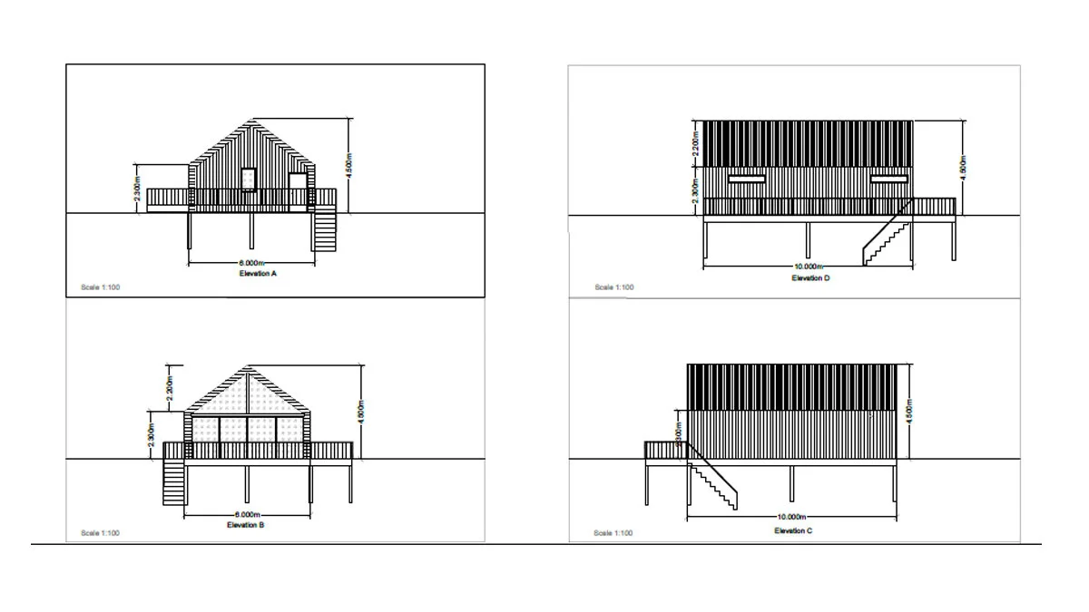
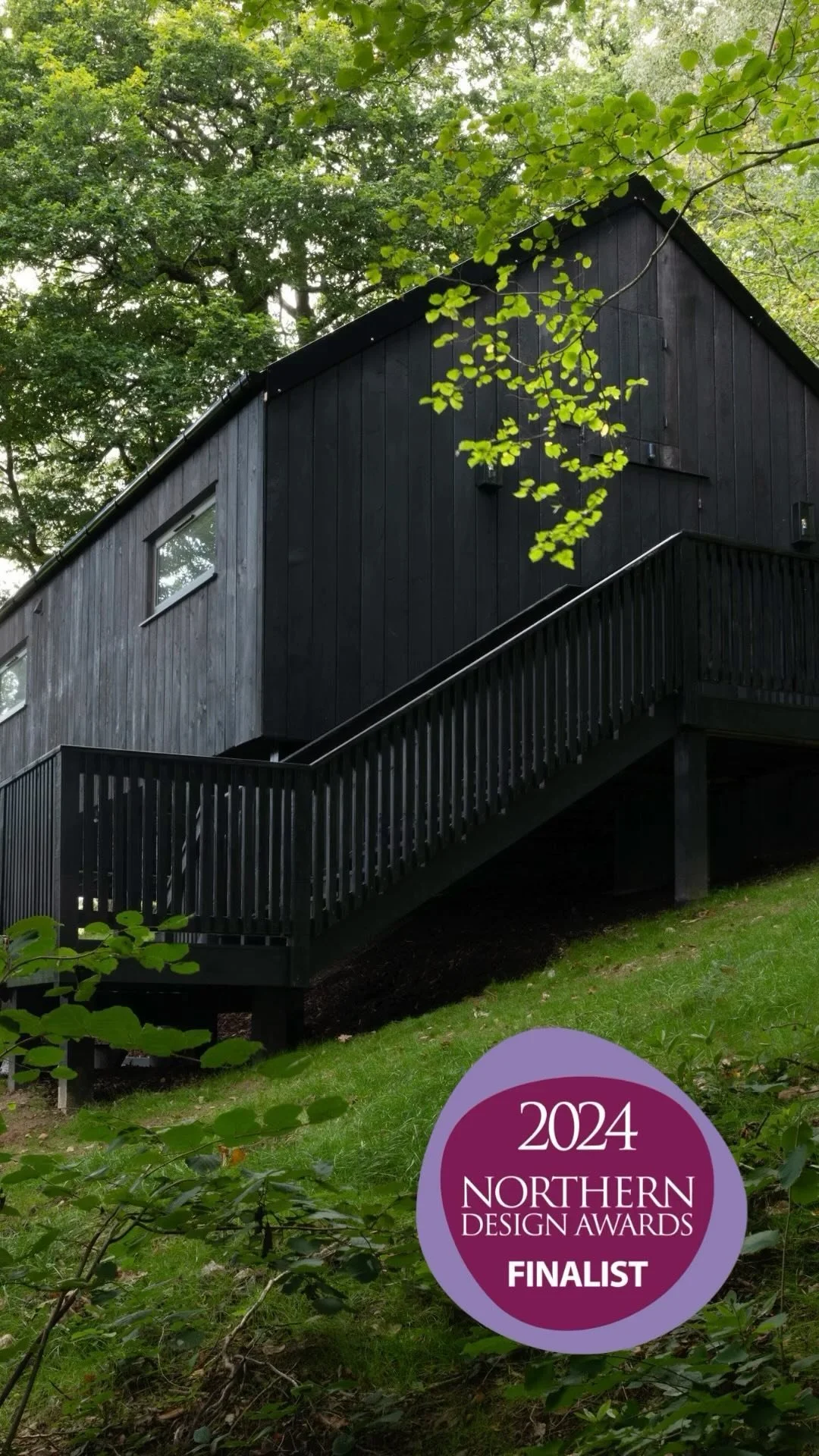
If you follow me on instagram you may have seen that I am in the process of designing 2 cabins, one for a family and one for a couple, that will be set in Ancient woodland behind our house in Mid Wales with views onto the neighbouring farmland.

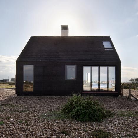
The cabins are 60m2 and will be clad in black wood and are very Scandinavian inspired. I have always loved the Shingle House in Dungeness and was lucky enough to visit it last year and loved how the cabins look like a silhouette.I always knew i wanted to the cabins to have a black exterior and seeing this house reaffirmed by decision. When inside the emphasis will be on the views out the front so the whole of the front wall will be glass to maximise those views and bring lots of light into the space.

The cabin design

The cabin design

Shingle House Dungeness

Shingle House Dungeness

The cabins will be a home from home and will have many of the comforts that people come to expect from a luxury holiday cabin; washing machine, dishwasher (who the hell wants to wash up when they’re on holiday?!!) Netflix, wifi, super king beds and a fully decked out luxe bathroom with baths and showers.

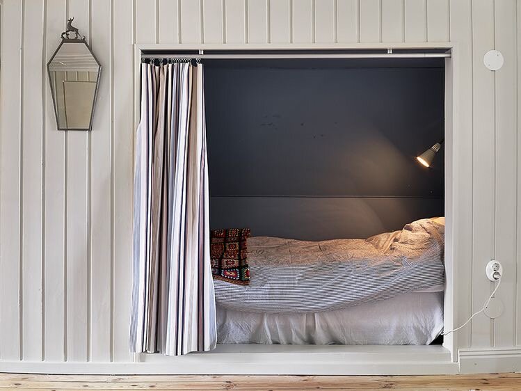
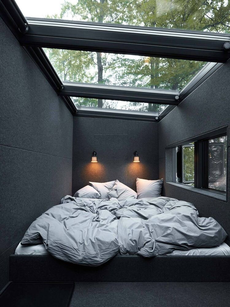
The family cabins will feature bunks for the kids and a cosy sleeping nook for the adults whilst the couples cabin will have a sunken bed with views looking out into the woods.


Here is a photo from winter showing the position of the family cabins, prime position under neath the massive Oak tree.

The plot in which the family cabin will sit

The plot in which the family cabin will sit

We have worked with ecologists to create a woodland management plan for the site as many of the trees that have taken over the wood are non native and crowding out the native trees. The woodland plan means we are allowed to fell some of the sycamore and take down some of the older branches off the oaks and more established trees to make the woodland safe and to actively promote more growth. We have also coppiced some of the hazel trees, which means we have taken off a lots of the top growth, this actually helps strengthen the tree and promotes lots of new growth. The canopy of the woods will also be thinned out to allow some light to penetrate the woods, at the minute the trees are competing for light and growing very tall and spindly to try and reach any sunlight. By opening up the canopy and letting more light into the wood we will encourage more diversity and see more wild flowers growing.

As you can see in the image above the bracken and brambles have also taken hold in the woods over the years and we wanted to clear this to again allow for broader diversity in the ancient woodland, the bracken and brambles are extremely invasive and suffocate anything else that is trying to grow so by clearing it out we will create the perfect environment for other ferns and native plants to grow and help attract more wildlife to the woods. We wanted to go down the eco friendly route to do this so rather than treat the woods with poison we are employing the help of some pigs who will turn the woodland floor over and eat all the rhizomes and stop the bracken and brambles in their tracks and prevent them reappearing next year. We have bought 3 x British saddleback pigs who are used primarily for this job and are also known as conservation pigs, they will also help eat all the smaller saplings in the wood and some of the fallen acorns, the rest of the acorns will be pushed further into the ground which helps them germinate.

The view looking out from the family cabins to the farmland

The view looking out from the family cabins to the farmland

Keep your eyes out on my instagram for more updates with the woods and if you would like to be one of the first to know when we are taking bookings then click here

Modern design classics

I love a modern design classic, especially modern classic chairs! These are the styles that will never go out of fashion and will suit any interior space and give it a sense of gravitas and style.

There are many designs that are now considered design classics and many of them are now classed as vintage pieces and go for good money at vintage auctions and sites. They are often copied by the high street which is testament to their enduring appeal.

Some of my modern classic design favourites are below:

The Egg chair by Arne Jacobsen

The classic Egg Chair designed by Arne Jacobsen was made in 1958 for the interior design of the Radisson Blu Royal Hotel in Germany.

I love the soft curves of this chair and it takes colour really well, this design would look great as a statement piece in a modern space with high ceilings

Arne Jacobsen Egg Chair

Lounge Chair by Eames

Designed by Charles and Ray Eames, the Eames Lounge Chair is the pinnacle of this mid-century wave of modern chairs. It was constructed in 1956 with a plywood frame and leather cushioning but now comes in the colour, leather grade and base style of your choice.

This is a piece that is just at home in a hotel reception as it is in a Victorian terraced house. Its a classic item that will never date and will only look better with age

Lounge chair Eames

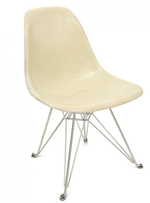
Eiffel Base Shell Chair by Charles and Ray Eames

The Eiffel Base Shell Chair looks exactly how it is described as the base legs reflecting the Eiffel Tower shape and the seat resembling the curves of a turtle shell. Designed in 1948 it was a simple side chair that has only become more popular with age and is one of the most copied chairs on the high street.

A classic chair that can be used anywhere in the home

Eiffel-Shell-Chair2-582x787.jpeg

The Tulip Chair by Eero Saarinen

A curved chair that made history with its pedestal base as the first one legged chair. It is a pure expression of modernism and is as popular today as it ever was.

This chair looks great in a retro or minimalist setting

Eero Saarinen Tulip chair

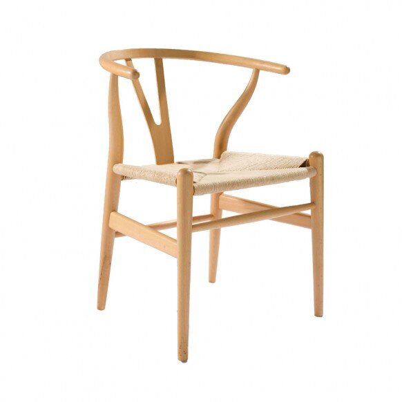
Wishbone Chair by Hans Wegner

The Wishbone Chair was designed in 1949 by Hans Wegner and has been in constant production ever since. Its a timeless icon of modern danish design, the Wishbone Chair offers comfort and stability as well as satisfying aesthetic desires for distinctive, elegant form.


wishbone chair

There are lots of items currently for sale on the high street that i believe will become future classics such as these and don’t have a huge price tag.

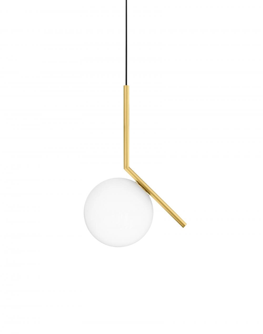
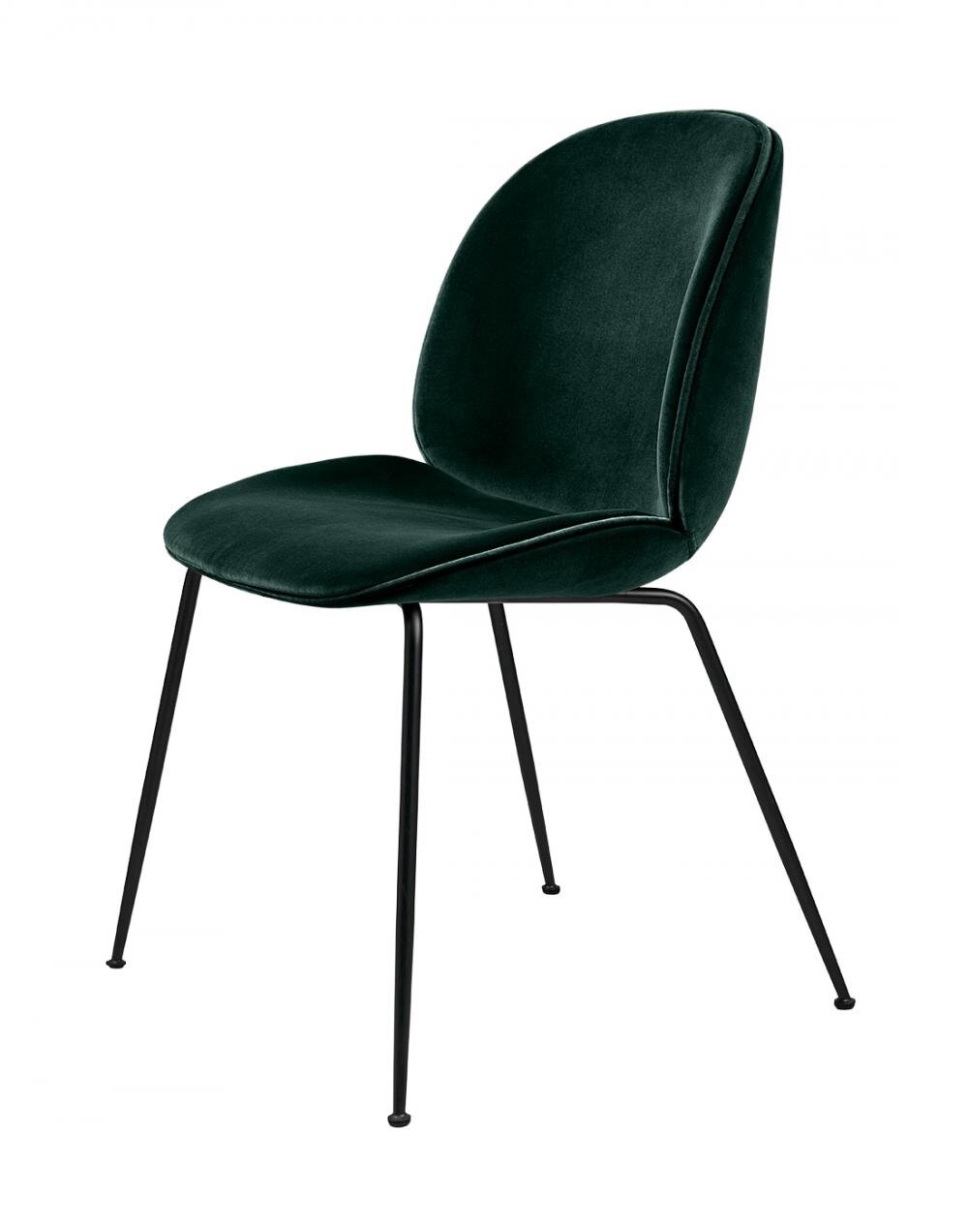
I would say anything by Michael Anastassiades for Flos, Gubi’s beetle chair, anything designed by Russel Pinch and his wife Oona Bannon for Pinch London and Space Copenhagen. All are beautifully made and fuse both style and practicality in one design.

6 interior design mistakes to avoid

There are many design rules out there such as making sure to layer your lighting, mix up textures fabrics to add depth and interest to a space but for many the phrase ‘some rules are meant to be broken’ rings true. But is that correct when it comes to design?! Knowing the rules and how to break them is key and something an interior designer is skilled at doing. There are some design rules, however, that are there for a reason and breaking them is big no no. Here are my 6 design mistakes that must be avoided at all costs.

Design mistakes to avoid #1

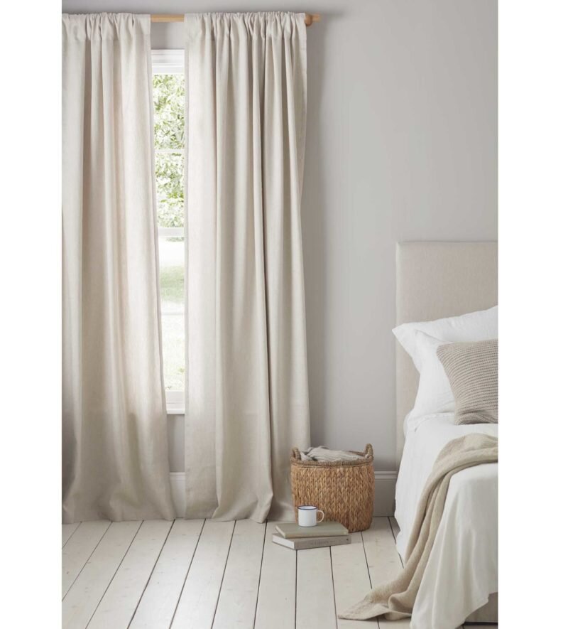
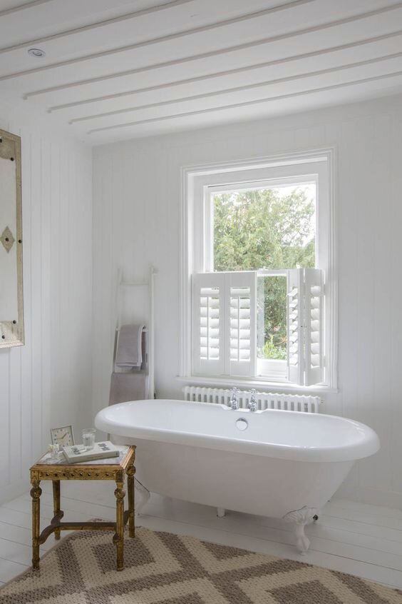
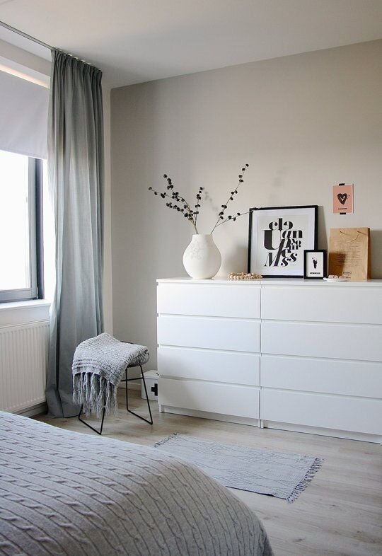
Short curtains - I can’t believe that people still need to be told this but short curtains are a definite no no. if you are worrying that you won’t be able to feel the heat from the rad beneath the window then invest in a roman blind or shutters. Curtains should always hit the floor and pool slightly, this gives the feeling of luxury. Short curtains look like they have been an afterthought in the design process and you panicked and picked up any old curtain in Dunelm. So many places can make curtains for you in inexpensive materials, such as Ada&Ina and with companies such as Zara Home, H&M and Ikea offering inexpensive ready made full length curtains there really is no excuse.

You can also add eyelet curtains to this list!

Interior Designer North Wales

There are so many alternatives and ways to dress a window and the above images are great examples. If you are going for full length curtains then they must touch the floor, if you want privacy but don’t want to trap heat from the radiator you have the option of using a roller blind and curtains as alternatives. There is no excuse to ever have short curtains and it is the one mistake ALL designers notice in a space.

Design mistakes to avoid #2

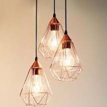
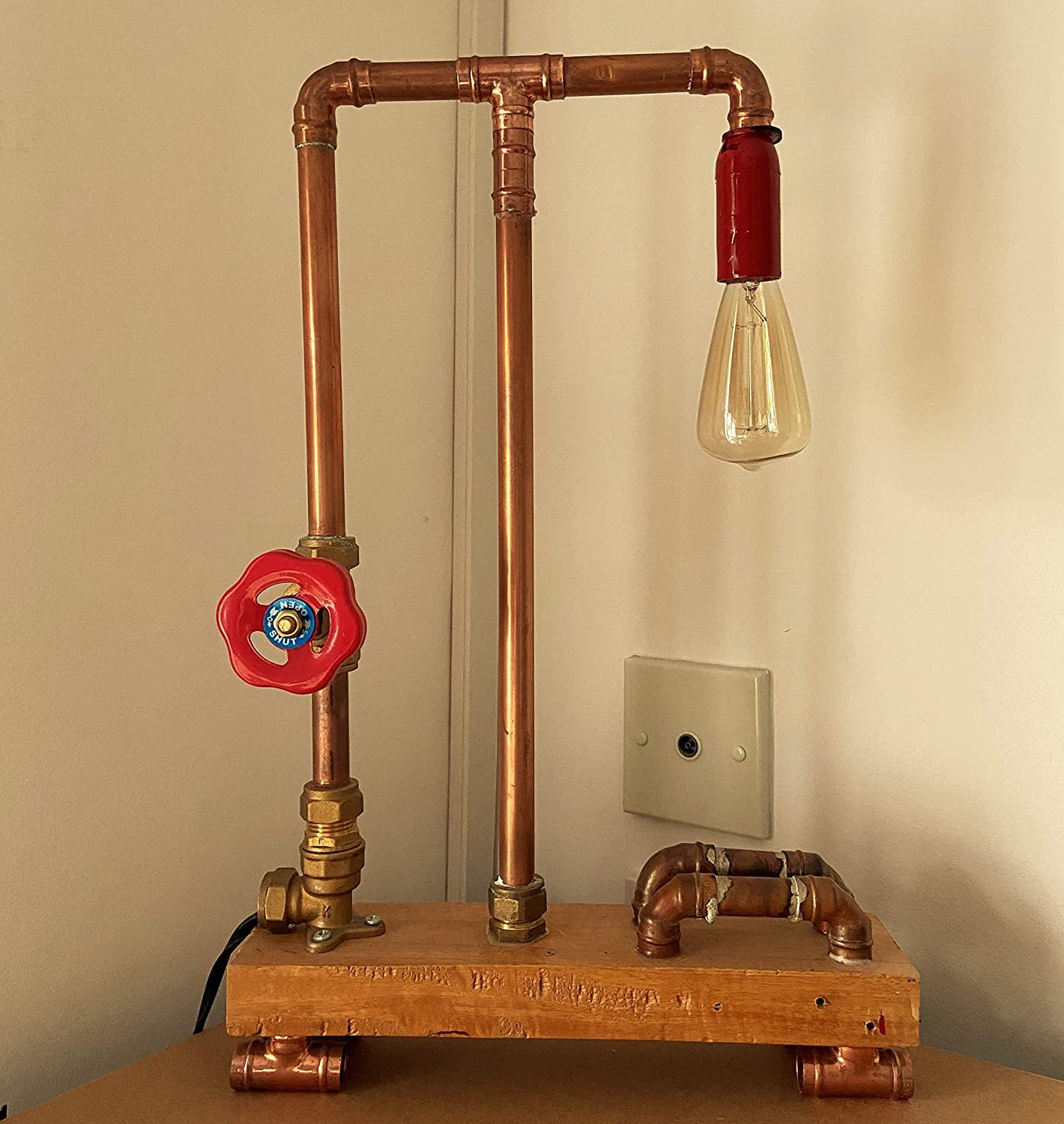
Copper wire lights -. As well as copper wire light pendants, copper pipe lighting can all go into room 101. It was too much of a trend and already feels dated.

Design mistakes to avoid #3

Live laugh love wall decals -there is no reason to ever have these on your wall. If you have a space that you are keen to fill then there are plenty of places online selling inexpensive artwork that could take the place of these decals.

Interior Designer North Wales

Design mistakes to avoid #4

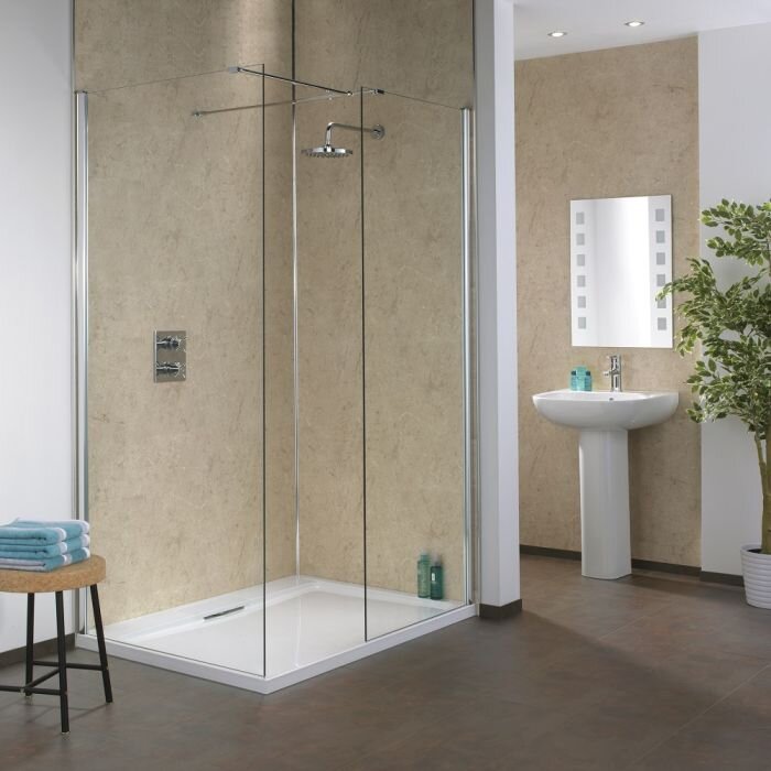
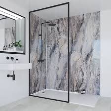
Shower panels. These started life being used in caravans as a really inexpensive way to waterproof the shower area and this is where they should stay. I understand why people may go for them, no grout to get dirty, easy and quick to apply and relatively inexpensive to buy and also to fit but I have never seen them look good and they always end up looking cheap compared to tiles.

When I worked in a kitchen and bathroom showroom we had so many developers of low end houses and people doing up rentals or holiday lets buying these for all these reasons, but it doesn’t matter what design you put on them they will always look cheap and your bathroom will look like it belongs in a caravan.

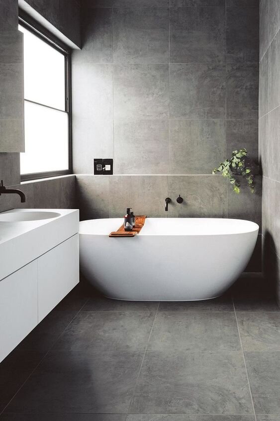
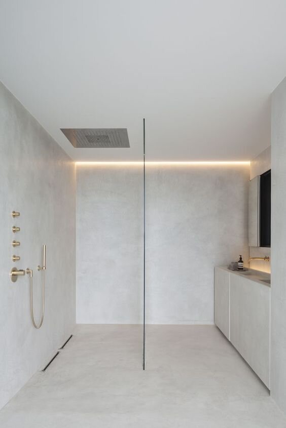
If you are after floor to ceiling design with minimal grout lines then you have the option to go for large format tiles where you are minimising the amount of grout lines or tadelakt where you are doing away with grout lines altogether

Design mistakes to avoid #5

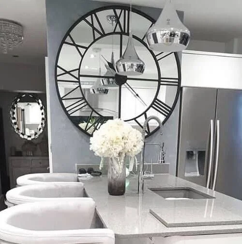
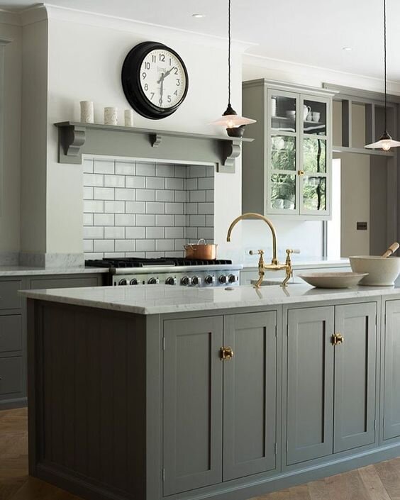
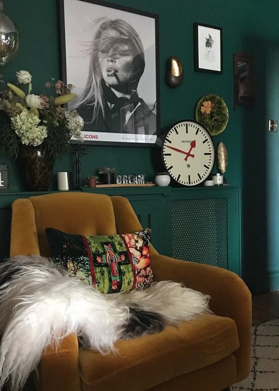
Extra large clocks - you don’t live in Paddington station, your clock doesn’t need to be that big.

Interior Designer North Wales

If you want to make a feature of your clock there are other options such as these below. above a mantle in a size thats relative to the space and also against a bold backdrop.

Design mistakes to avoid #6

Matching your toaster, kettle and all other kitchen accessories. You don’t need everything in your kitchen to match, in fact having different textures and elements helps to create interest in your scheme

Interior Designer North Wales


What does an Interior Designer do?

I often get asked “What does an interior designer actually do?'“

Interior design can sometimes be confused with interior decoration, choosing various wall colours and finishes are an important part of interior design. But it is not just that.

Interior design is all about creating functional spaces in commercial and residential buildings. Many of us Interior Designers are involved right at the beginning of a project, working closely alongside the architect and builders on structural changes and lighting plans as well as designing the final fixtures, fittings and furnishings. We can provide bespoke designs for those awkward spaces, make sure the flow of the kitchen is just right for how you live and enhance the overall function of the room

What you see on Instagram and in magazines is the culmination of a lot of work behind the scenes and regular communication with clients to achieve that look, believe me, good design doesn’t happen over night!

Interior Designer North Wales

Interior Designer