Hotel Dylan, Amsterdam

Going to a new city and discovering new hotels and bars is probably up there with one of my favourite things to do. I love surrounding myself with beautiful design and The Dylan in Amsterdam is a hotel that has stayed with me and inspired me ever since I visited it a few years back.

The Dylan has a discreet but comforting atmosphere. It has a feel of old-world elegance with the wood-panelled walls, leather upholstery, stripped back original floor boards all set against contemporary elements such as the geometric light fittings over a long, curved black marble bar that invites you into the space and Norman Cherner Mid Century bar stools.

Its a great example of how the traditional and modern can co exist in a space if done correctly and is something I always strive to do in the designs I create for my clients.

Top Tips for renovating your property

Taking on a renovation is a big and time consuming task that will take over your life, I know first hand how much hard work goes into one and what it takes from you both emotionally and financially. Below I have outlined my Top tips for renovating for those who are just about to embark on this journey and hope that they help you

Top Tips for renovating #1

Your roof is your number 1 priority

The roof is one of your biggest priorities when renovating, if you don’t have a structurally solid and waterproof roof then there is little point doing anything else until this is fixed. You can have the nicest interiors in the world but if that roof leaks its going to cost you and ruin all your hard work.


Top Tips for renovating #2

Have a budget and add at least 10%

Renovations always throw curveballs and there is always something that crops up that you hadn’t budgeted for. Adding a 10% contingency to your budget should be enough to cover these and I almost guarantee you will use it.


Top Tips for renovating #3

Don’t cover up all the original features

You bought a period house/house that needs renovating for a reason. This is usually because of the chance it may have some hidden period features. If so, don’t hide them again, highlight them and make them a feature of the room.


 Top Tips for renovating #4

It will take you twice as long as a new build property

You spend so much time and money taking the building apart and stripping it right back to build it back up again, be prepared for the long haul


Top Tips for renovating #5

There will be a rollercoaster of emotions

Renovating isn’t for the faint of heart. It’s an absolute rollercoaster of emotions, those days when you uncover hidden period features that haven’t seen the light of day for years are some of the best days but the days when half the roof is off in the middle of the storm and the bedrooms have puddles of water in them and there is rain running down the stairs is definitely a low point. Be prepared.


Top Tips for renovating #6

Always have the end goal in site

Its good to have an idea of what you want to achieve in the property and have some vision boards/moodboards to help you keep your eye on the prize. Being able to visually show builders and plumbers what you want also helps take some of the guess work out of everything and helps minimise the chance of things getting lost in translation


Top Tips for renovating #7

Do your homework

You need to be prepared and know exactly what sort of boiler/heating system/where the kitchen is etc very early on in a renovation as the pipes may need to be moved or re routed. Having a plan and having an idea of what you want early on helps avoid any delays on site and means you don’t have the trades hanging around waiting for you to make a decision


Top Tips for renovating #8

You will spend most of your money on things you can’t see.

So much of your money will be spent on the elements of the house you don’t see but are the most critical places to spend money i.e The foundations, structure, insulation, drainage, waterproofing. Budgeting in these areas is a false economy and they are the fundamentals to a smooth running and water-tight house that will run well with no problems for years.


Top Tips for renovating #9

Make sure you get trades people onboard who are as excited about your vision for the property.

You will spend a lot of time with your builder/plumbers/electricians and a good working relationship is beneficial to all. Make sure you do your homework and pick people who are right for the job. Some builders enjoy the more challenging aspects of renovating properties where others like the ease of a new build. Choose one that you believe best fits your project and wants to implement what you want and your vision for the property.

Also remember that this is a work environment for them, and everyone wants to work somewhere nice so provide a suitable place for a break, a liberal supply of tea/cakes/biscuits and settle your invoices on time.


Top Tips for renovating #10 

Where to save your money.

If you are finding that your budget is taking a bit of a hit, then there are many places you can save money. An inexpensive kitchen from somewhere such as Howdens or Ikea can be made to look more expensive by not scrimping on the worktop and using quality and hard- wearing materials such as quartz. This will instantly elevate the look of the kitchen.

Toilets and sanitary ware are another place you can save money, a toilet is a toilet at the end of the day, and you can upgrade the lid and use more expensive taps to help elevate the design and make it look more special.

As a general rule, anything you touch or moves should be invested in as you will be able to feel the quality of these items.


So these are my top tips for renovating that will help steer you in the right direction but if you have any more queries about your renovation project or self build project and would like some advice then get in touch below to see how I can help.

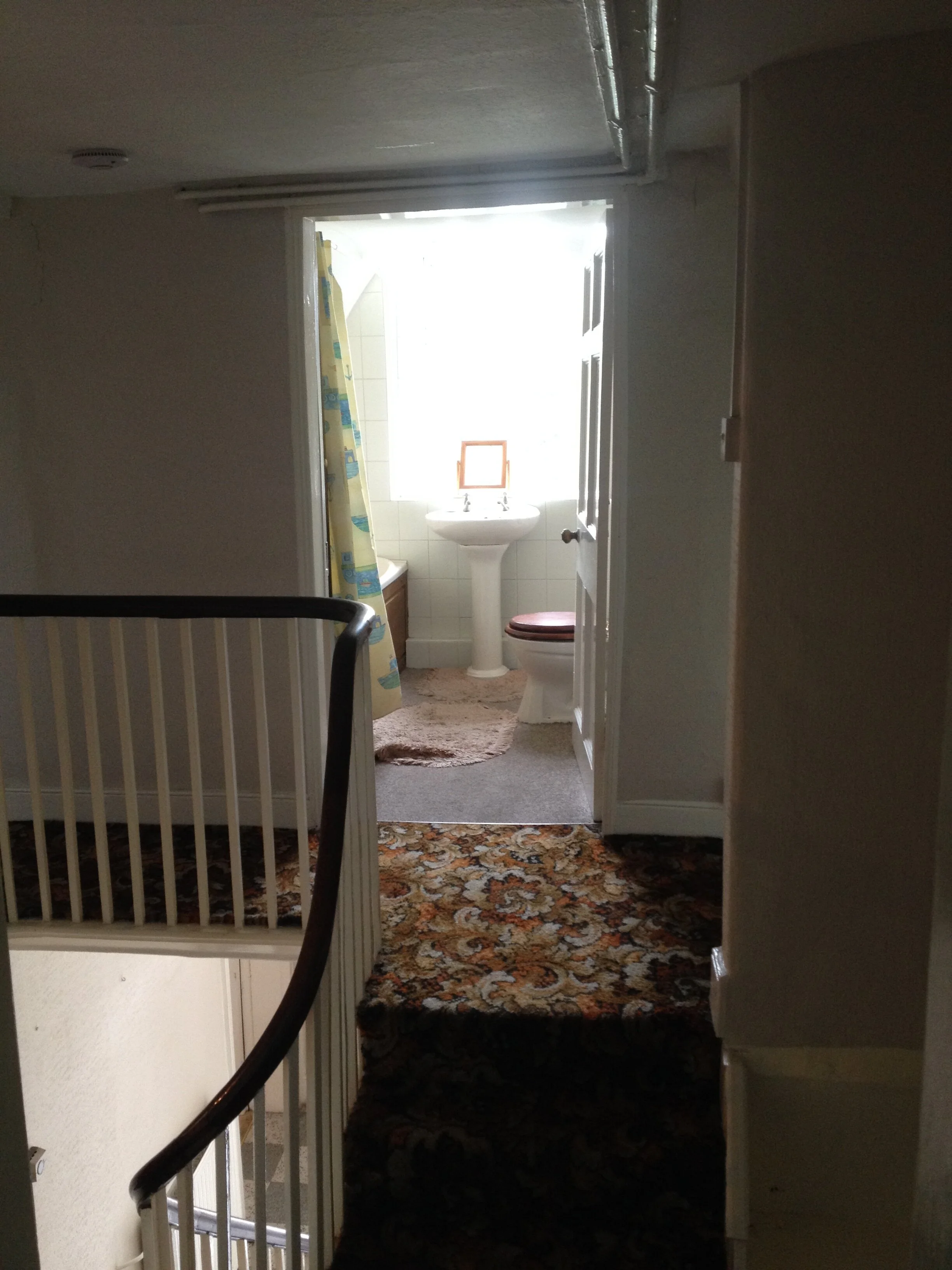
Renovation project Before

Renovation project Before

The finished House

The finished House

If you would like to see more photos of the project above then click this link and see why we were voted Reader’s Choice in the Homebuilding & Renovating Competition and highly commended for best renovation 2019

Further reading:

Basement Kitchen Design

Kafenion Birmingham

How to create a colour scheme

Benefits of hiring an Interior Designer

How to maximise your holiday let ROI


The standard of interior design in some holiday let properties on the market leaves me completely aghast. So many people are now moving into the holiday let business as a quick and easy way to make money but they aren’t giving any thought to the interior design of the property and they are just using lots of mismatched (and not in a good way!!) or cheap furniture in order to make the set up costs cheaper for themselves in the hope of then having a good ROI (return on investment). I can’t tell you how many times I have heard the phrase “we just want the cheapest we can as its for a holiday let”

To me this is a completely backwards way of thinking. By having good design as your USP you are giving people another reason to book your property against someone else’s and maximising your Holiday Let ROI. When your potential client is scrolling through the holiday let options a good designed place will stand out against all the other unimaginative and magnolia offerings and make people stop in their tracks, lingering longer on your images and increasing your chances of a booking. Good design means you can also charge higher fees for a good looking presentable and well dressed property as people have the perception that its worth more.

Unique Homestay - A great example of less is more

Unique Homestay - A great example of less is more


People are becoming more and more conscious of how they spend their money so give them a reason to spend that money with you. By having a good interior people are also more inclined to share to their instagram pages or with friends and family and talk up your holiday let thereby giving you lots of free promotion!

KillieHuntly - Showing how the right shots and lighting can create an interesting and evocative feeling.

KillieHuntly - Showing how the right shots and lighting can create an interesting and evocative feeling.

Dressing the space and spending a small amount on styling pieces help make the space feel more homely rather than a place someone rents out purely to make money.

Kiphideaways - Mismatched chairs in one colour and a punchy rug add interest to the space

Kiphideaways - Mismatched chairs in one colour and a punchy rug add interest to the space

It doesn’t take a lot to achieve something that stands out against the competition and maximising your ROI. By knowing where to spend the money to improve your property you will increase the amount of bookings you have, increase your ROI and make your money back quicker and with more ease.

Kiphideaways - A bold rug and large comfortable armchairs in a space makes the room feel inviting

Kiphideaways - A bold rug and large comfortable armchairs in a space makes the room feel inviting

If you have a holiday let space that requires some TLC in order to stand out against the competition and maximise your ROI then get in touch and see how I can help you.

Interior Design Consultation Shropshire

Back In January 2019 I was contacted by a client in Shropshire who needed some interior design help with her extension and pulling all the ideas that she had into a cohesive scheme.

Below are a couple of pictures of the space before the builders got to work. They wanted to open out this kitchen/diner space and create a brighter open plan living area that their whole family could sit in and enjoy.

The extension added so much light and much needed space to the house.

The clients worked with a local Shropshire Kitchen design company to create the kitchen, they wanted something clean, modern and with a large island that the whole family could sit at.

The space was designed so that the whole family could enjoy being together and also for entertaining friends and family.

The utility was was designed for pure practicality and the client wanted to maximise the storage in the space so the surfaces remained uncluttered. The light cabinets and worktops keep everything feeling fresh and airy.

In the downstairs WC, just off the utility room, we wanted to go for something a bit more fun. We decided upon this Art Deco style wallpaper from Divine Savages and lights from Fritz Fryer

Interior Design Shropshire

If you would like any help with your own project then get in touch and lets see how I can help

How to combine pattern in your home

A couple of weeks ago I was asked to contribute to the John Lewis Blog, ‘The Edit’, by their Interiors Editor Jennifer Morgan (www.theformereditor.com), she needed some quotes about all things pattern.

Even though I’m not a maximalist and prefer my interiors to be quieter I still have very strong opinions about the best way to incorporate patterns into a scheme. If you would like to hear how I incorporate pattern into the scheme that i create I have expanded on many of the questions Jen asked me below but if you would like to check out the John Lewis blog, click here.

Interior Designer North Wales

What are your top tips for combining patterns?

​Vary the scale that you use, pair a large scale print with one medium and one small print. Its the difference in scale that will stop them competing with each other and create an interesting scheme.

I always like to make sure that there is a common colour that runs throughout the different patterns too, say a blue floral with a blue stripe. This gives unity to the scheme and is a bit more restful on the eye than lots of clashing prints.  

Any no-no's?

​Mixing colours and prints that don't have the same colour intensity, so i wouldn't pair something with a black background and bold jewel colours with something that has a white background with a pastel colour design. You need to make sure all the hues work together otherwise it can be quite jarring 

How do I balance a busy duvet cover? 

​By teaming with some bold cushions in a solid colour, one that is found in the print would help create a good scheme and balance out a busy duvet, but if you wanted to be really bold choose a colour that contrasts with the dominant print colour.

Should I use patterned on bed linen, walls and curtains? Any rules you always follow?

​Tone on tone patterns can be quite an elegant and simpler way of layering patterns in a room, so lots of patterns and prints in a green as an example would be a way to incorporate a lot of pattern into a room without it being overwhelming.

Always break up patterns with solid pieces of colour, the eye needs a place to rest, it can be a little bit overwhelming if all it sees is layers of different prints.

If you do want to use lots of varying patterns in one space make sure they are distributed around the room rather than in one space.

How much pattern should be on my mood board? Should I always see a pattern in real life to get a sense of the scale?

​Always try and get a sample to get an idea of the scale and also the colour as seeing something on screen and real life can be very different. 

How much to have on your mood board depends if you're a maximalist or a not. I like to have about 30% of the mood board dedicated to a pattern to provide a bit of interest, this isn't a hard and fast rule that I use as i work by eye a lot of the time.


If you are struggling to combine patterns effectively in your own scheme then get in touch to see how I can help.


Further Reading:

How to use colour in your own home

Polished concrete floors; pros and cons